This will be the third post for today. During the short time I worked with this blog I've already come to some new realizations. After unsuccessfully trading stocks for many years I decided to think hard about what really works and what is more left to chance. I knew there was really only one patter I felt was realiable, the blow of top. I also knew it tended to manifest itself in shorter time periods on leveraged ETFs and in longer periods on single stocks. I have still to find out if that is only due to leverage, or if there are other differences too, which is most likely. It's clear to me that the shorter time patterns found on ETFs are more profitable sinse they take shorter time to play out. However, there are only so many leveraged ETFs and most of the time there is no pattern available at all. That is where the individual stocks come in, but since they have longer term BOTs timing is more difficult, the pattern takes longer to play out and a wrong entry will take longer time to be corrected. This is highly unfortunate because when an opportunity in a leveraged ETF appears money has to be available to play it. Due to this I will focus more attention on the leveraged ETFs and practice patience in an even larger amount.
I will also focus more on the theory of ETF volatility. The inversed (mostly) leveraged ETFs do not display long period of build ups and then blow of tops, they display periods of volatilaty consisting of a number of BOTs. After studying these patters tonight I noticed that they are not random but that they appear in pretty strong patterns. The BOTs appear in a megaphone pattern, in oscilations of increasing magnitude. In the end they get smaller with their height limeted by the supporting floor trendline for the megaphone pattern that after break of support becomes recistance.
What better then to illustrate with some charts:
 |
The tops gets larger in size until the floor trendline acts as resitance and the oscilations becomes smaller
|
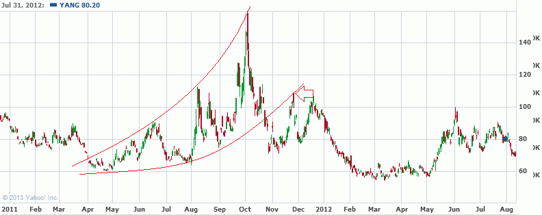
The tops gets larger in size until the floor trendline acts as resitance and the oscilations becomes smaller, again. And it's the same ETF a few moths later.
 |
| This one could be seen to have several parts. The main larger part is a really clear megaphone pattern. And once the floor is broken it holds as resistance in both the large and small pattern. (This is a bank ETF at the financial crises 2008) |
 |
| It's hard to see where the trendline gets broken on this one but it's the same principle. |
 |
The oscillations doesn't really get larger on this one, the last peak is marginally higher then the first one though. But again resistance comes in on cue and the bottom floor trendline has the same slope as the other charts.
|
 |
| And again. |
I didn't handpick these for the pattern. I just looked after periods of volatility and the charts all displayed the same pattern. The pool of data (volative periods in leveraged ETFs aren't really great but still it's a very interesting phenomenon. Even more interesting considering todays price action in DUST which I have been following closely on this blog.
 |
| DUST, yestererday. |
Today DUST fell 26%. It's safe to say I played this pattern much too concervatively, afraid of commiting too much money incase the build up would be big. Had I known about the sloped floor line acting as resistance in all exampels shown of valatile ETF periods I would have played it much more aggressivally. Maybe we will get another peak up against resistance soon, that would be a gift. Meanwhile this is a very strong pattern saying that DUST will loose a lot of value in the future.
So to summarize my longest and most important post so far on this blog: Periods of volaltility in leveraged ETFs are a gift of predictabilaty. Something I'd like to do in the future is to see if I chart a normal stock with a three time magnified daily movement, like a three time leveraged ETF, will display similar patterns. Another thing I'd like to do is to check what happen to the other ETF in the leveraged ETF pair after resistance is touched.